|
|
London North Western
Railway:
Midland
Railway:
Stratford
Midland Junction Railway
|
|
LMS Route: Evesham to Birmingham
Salford Priors station: mrsp1420
 |
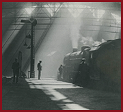
An undated view looking along the platform towards Evesham with
the goods shed partly visible on the right. The LMS 'Hawkseye' or 'Target'
station nameboard can be seen on the right. The two upright posts were
sculptured so that the top section was thinner adjacent to the nameboard. As
can be seen the top horizontal rail was also scuptured. In this instance, the
verticals posts have been repaired, due to their rotting at ground level, by
the addition of another post fixed on the outside. When new the station
nameboards, that is the 'Hawkseye' or 'Target' part on the board, were
originally painted yellow with black letters & had fragments of glass
embedded in the face to help the signs stand out at night. The Midland used a
very attractive livery for buildings, which was used on everything other than
signal boxes. A very pale cream called 'Denby Pottery Cream' was used for
planking, valencing, etc, with a reddish brown officially called 'Venetian Red'
for ironwork, framing etc. Doors were painted in a deep red, almost certainly
the same colour as was used on loco's and coaches. Window frames were painted
white. Poster boards were back with white framing & lettering, either
'MIDLAND' or 'MIDLAND RAILWAY'. Station signs & running in boards were deep
blue with white lettering & framing. The well known diagonally planked
wooden fencing was always creosoted, never painted so should be finished on
models in black or very dark brown; gates however were cream. Lamposts and the
like were finished in the cream & brown. Signal boxes had a different
colour scheme to make them stand out on the lineside; the planking was painted
Lemon Chrome Yellow, as were signal posts, with the framing, stairs, guttering,
finials etc. finished in the same Venetian Red as on the other buildings.
Window frames and internal walls were white. The BS 381C references for these
colours are 354 for the Yellow and 412 for Venetian Red. The yellow faded over
time to a 'Cotswold Stone' buff shade. The nameboards was deep blue with white
lettering & edging.
The LMS clearly did not see imposing a new corporate image in
its stations as a priority, as until 1936 it continued to use the pre group
colour schemes, gaining a reputation for shabby & run down looking stations
in the process. In practice virtually no stations were repainted by the LMS
before 1936, though now that the Furness & NSR came into the Western
section they would have used LNWR colours if there was any repainting. Even
after the new standard schemes were introduced it took time before all the
stations had been treated, so any modeller wanting to represent the LMS pre-war
would be best advised to use the colour scheme of the appropriate pre-grouping
company but with LMS poster boards. The company began thinking about a new
livery for buildings in 1931, when standard colours of 'stone' and 'brown' were
introduced for all signal boxes, the stone colour being used on planking and
the brown everywhere else. However, the S&T department did not take over
responsibility for painting signal boxes until 1933 so for two years things
were a bit hit and miss. Internally the brown was used up to dado level and the
stone above, the interior of the roof and the window frames being white.
Despite this new standard scheme some boxes on the Central Wales line was
painted cream & green to match the stations in 1937 - it was a long way
from headquarters! The photograph below of Embsay box shows this livery
beautifully. The nameboard was yellow with black lettering. Stations did not
receive a standard painting scheme until 1936, a full thirteen years after the
LMS was formed. Two light colours were introduced, 'cream' and 'Portland Stone'
which were to be used with one of three darker shades, 'brown', 'red' and
'green'. The red was a dark shade similar to Midland read as used on LMS loco's
and coaches, and the brown was very similar to the former LNWR colour. The
majority of stations were repainted using the red or brown as the darker shade,
with the green supposedly being reserved for bucolic stations in the middle of
nowhere with the view that the buildings would blend in better with the rural
landscape. Poster boards on the LMS were always black with the framing and
lettering in white; station signs were similarly painted. Running in boards
were white on black until 1936, when black lettering on a yellow background was
introduced along with the new 'target' nameboards.
The information on the station colour schemes is courtesy of
Peter Smith of Station Colours.
 back back
|