|
|
London North Western
Railway:
Midland
Railway:
Stratford
Midland Junction Railway
|
|
LMS Route: Rugby to Tamworth
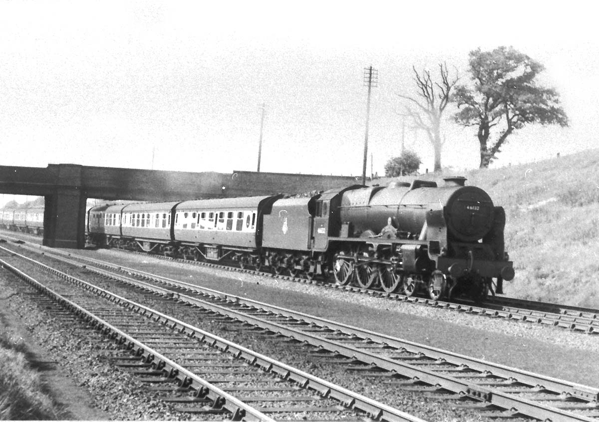
Trent Valley Lineside: lnwr_tvl4454
Ex-LMS 4-6-0 Royal Scot Class No 46132 'The King's Regiment
Liverpool' is seen on an up express service south of Tamworth. The tender has
British Railways' 'Cycling Lion' crest (see below) which was the first
crest applied by the British Transport Commission. Built in November 1927 as
LMS No 6132 and with a parallel boiler by the North British Locomotive Company
of Glasgow, No 46132 was renumbered by British Railways in April 1948. It was
then rebuilt by British Railways with the Stanier 2A tapered boiler in 1949,
which would have been shortly before the above photograph was taken, and
remained in service until February 1964 when it was withdrawn from 12A Kingmoor
shed in Carlisle.
While the Railway Executive experimented with different
colour schemes for its locomotives, carriages and wagons (during 1948, even
though British Railways had been in existence for months) the hunt was on for
some kind of emblem which could be applied to trains. The Railway Executive and
BTC’s saviour in this matter is the subject of some confusion. According
to Haresnape (1989: p12) it was Abram Games (1914-1996), a brilliant graphic
artist who had already produced some excellent modernist posters and products
and would later go on to devise the graphic identity for the Festival of
Britain in 1951. Not so, according to Jackson (2013: p94) and Lawrence (2016:
p11), it was the work of sculptor Cecil Thomas (1885-1976). Whichever of them
it was, they created the “lion on wheel” totem/seal for the BTC,
which could be used for any of its subsidiaries, and it was the British
Railways version of the BTC totem that was eventually adopted by the Railway
Executive for use on locomotives. This image of the BTC seal seems to back up
Jackson and Lawrence’s attribution, as it features Thomas’s
signature. The most likely explanation for the confusion is that Thomas
sculpted the original seal, while Games adpated it as the coloured lion on
wheel used on trains.
Whatever its precise parentage, it’s not universally
admired, with many railway enthusiasts still sniffily suggesting that the lion
looks rather emaciated. But for my money, it’s a stylish and dramatic
piece of graphic design, the detail on the lion’s mane and its fierce
countenance especially. What this emblem wasn’t, however, was in any way
modern or forward-looking. It harked back to heraldic imagery via a sort of
pre-war Modern / Art Deco style. The lion stands on what is clearly a steam
locomotive wheel, despite the fact that British Railways already had many
electric trains and some early diesel locomotives, all of which pointed the way
to the company’s future. It’s not clear whether Games/Thomas were
responding to the BTC’s brief or whether they viewed British Railways as
an old-fashioned company (Games was apparently famous for producing designs and
then resigning commissions if his client wanted something different). Either
way, the lion on wheel, whatever its intrinsic artistic merits, looked much
less modern than London Transport’s corporate identity, which dated from
the previous decade. Despite the fact that Gill Sans was essentially British
Railway’s corporate typeface, the lion on wheel emblem used a different
typeface altogether, with different weights of diagonal strokes on the
lettering particularly noticeable and obviously different from Gill Sans. The
good news was that, despite the fact it was neither particularly modern nor in
keeping with British Railways’ corporate typeface, nor was actually
British Railways’ own totem, it looked super on British Railways’
trains. It was reversible, so that the lion always faced forwards on steam
locomotives (many diesel engines had a cab at each end and could run in either
direction, so the lion faced left on these, and didn’t always face the
direction of travel). But again, it wasn’t a logo as such, because it was
rarely seen anywhere but on trains.
Courtesy of The Beauty of Transport.
 back back
|